
In this post, I’ll show you how to choose the right font combinations to add clarity to your brand.
When thinking about fonts, the first thing you think of is probably not personality, ease-of-use, or message clarity, but these are three things choosing the right font combination can help with.
In the last post, we talked about choosing the right color palette to set the tone, and evoke the moods and feelings you want your audience to perceive about who you are and what your business has to offer. Today, we’re going to explore how to do the same thing for your business with fonts.
There are three main areas within your branded marketing materials that you’ll want different fonts for:
Let’s break it down.
The font that makes up the heading is often larger, bolder, and more unique than the fonts that make up the rest of the typography for your brand. These fancier fonts are often called “serif fonts”. That is, they have serifs, or tails at the end of the character’s stroke.
Probably the most well-known serif font is Times New Roman.

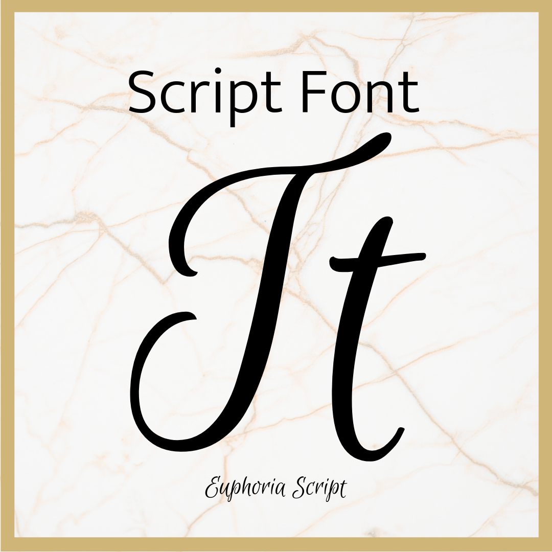
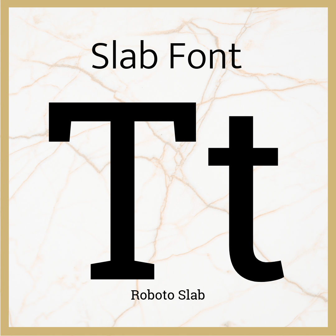
Other types of fancy fonts you can use for the heading in your font pairings are Script fonts (they look like handwriting or cursive), Decorative or Display fonts (highly stylized fonts, and may have images, lines, or patterns inside the characters), and Slab fonts (similar to serif fonts, but with a more block-like tail to the end of each character. Think typewriter style font).


You can choose any type of font you’d like for your header. There are literally hundreds, if not thousands, to choose from. If you’re having trouble narrowing it down, start by choosing from the list we just made—serif, script, decorative, or slab. Search for these types of fonts on Google, Pinterest, or your favorite web browser, and find one that speaks to you.
Although you perhaps have the most creative liberty to choose something unique with your header font, you always want your headings to be easily readable and understood by your audience. Choose a font that fits the personality of your business, the style of your company’s values, and evokes the overall feelings you want your audience to have when they view your marketing materials and website.
If your logo is more text-based than graphic, it may also be a good idea to choose the font you use in your logo as the same font you use for your heading. This keeps consistency throughout your brand, and helps with recognition, and continuity of style and recognition throughout all of your materials—print or digital.
As you continue to create an authentic visual brand identity for your business, it is important to keep this type of consistency in mind; even in details that seem as small as choosing the write typeface.
Now let’s jump down to the body text.
Once you’ve chosen the font for your heading, it’s time to create a font pairing by choosing a font for your body text that will clearly carry your brand’s message. While you could choose a serif font for this, it is my strong recommendation that you choose a sans-serif font for your body text.
A sans-serif font is a character without the stroke or decoration at the end of its line.

The font that makes up the text you are reading in this blog post, along with many other web articles, is a sans-serif font.
Sans-serif fonts are easy-to-read, work well in lower resolution (which is especially important for any text that will be online), and add a clean look that contributes greatly to the strength and clarity of your message.
Don’t let its simplicity fool you—just like the fancier fonts, there are hundreds of sans-serif options to choose from.
To find the right body text font to pair seamlessly with your heading, type out a word, phrase, or your company’s name in your heading font at a larger size, and then try typing out a word or phrase beneath it in a smaller, sans-serif font. Try as many different combinations as you need until you find the right one.
Your body text should compliment your heading text. The two fonts should flow seamlessly together between designs. The body text font should convey the feeling of your brand’s values and style in the same way that your heading text does, but in a manner that is clearer, and more easy-to-read.
Need some examples?


You may be wondering why I haven’t talked about the secondary header font yet. This is because the secondary header can either consist of the same font as your heading or your body text, or it can also be a separate font of its own.
The purpose in choosing a font for your secondary header is to make an even smoother transition between the heading and the body text.
If the font for your heading isn’t too unique, you could go ahead and use a lighter version of the same font for the secondary header. An example of this would be using a bold serif or slab font for your header, and a regular or light version of the serif or slab font for your secondary header.

However, if you have chosen a script or decorative font for your heading, I would not recommend using the same font for your secondary header. Since script and decorative fonts are so unique, using them in both the heading and secondary header could lead to confusion, lack of clarity, and an overall muddled look of your brand materials.
If you’re going to choose only two fonts to pair for your brand font combinations, the option I would most recommend is choosing a heavier version of your body text for the secondary header. This is a simple way to create a clean, cohesive, easy-to-read look, bringing clarity across your brand.
Here’s what that can look like:


Your other option is to choose a third font for your brand font combination to act as a transitionary font. Choose either a simple serif font, or another sans-serif font that compliments the font used in your body text.
I did this when creating my brand font combination. Here are a few more examples:


Whether you choose to pair two fonts for your brand, or complete the typography of your brand font combination with three fonts, the important thing is that they flow easily together, make it easy for your audience to understand and digest the message you’re putting out there, and convey the values and overall message you want your brand to portray.
You might be surprised to find that this seemingly small detail of your brand presence can take some time to narrow down. However, taking the time to choose the right font combination for your brand is worth it! The proof is in the numbers. If you give this step the time it deserves, your audience will come that much more readily because you have made it easy for them to understand the authentic message you are putting out there.
Resource Links:
Where to find your fonts:
Google Fonts
DAFonts
1001 Free Fonts
MyFonts
CreativeMarket (My favorite!)
Where to find pre-paired font combinations:
A word about free fonts vs. paid fonts:
While there are many free fonts out there that are excellent to use (including in the list above), you may find that you want a font that is more authentic to the brand style you want to create. Typically, these fonts are not free, but provide additional features that free fonts may not offer—various weights such as bold, semi-bold, or italic, and symbols, characters, decorations, languages, or even currencies!
Take the time to look at both free and paid font options to find a full font family that will serve your brand style and needs best—both now and in the coming years as your business grows.
Ready to choose the right font combinations to add clarity to your brand? Choose two to three fonts that you would like to use within your own brand for your heading, secondary header, and body text. Make sure they are easy-to-read, evoke your brand’s personality, and help to convey clearly convey the message and values you want your brand to portray.
Make sure to use these fonts consistently across all platforms to create a strong, cohesive brand presence that will help attract your ideal clients.
Next week we’ll talk about imagery in part 3 of 5 easy steps every entrepreneur should follow to build an authentic visual brand identity.
Don’t miss out on a single part of this series! Sign up for our newsletter at the bottom of this page to have it sent straight to your inbox as soon as it’s posted.


